Connecting people
with
impact
stories
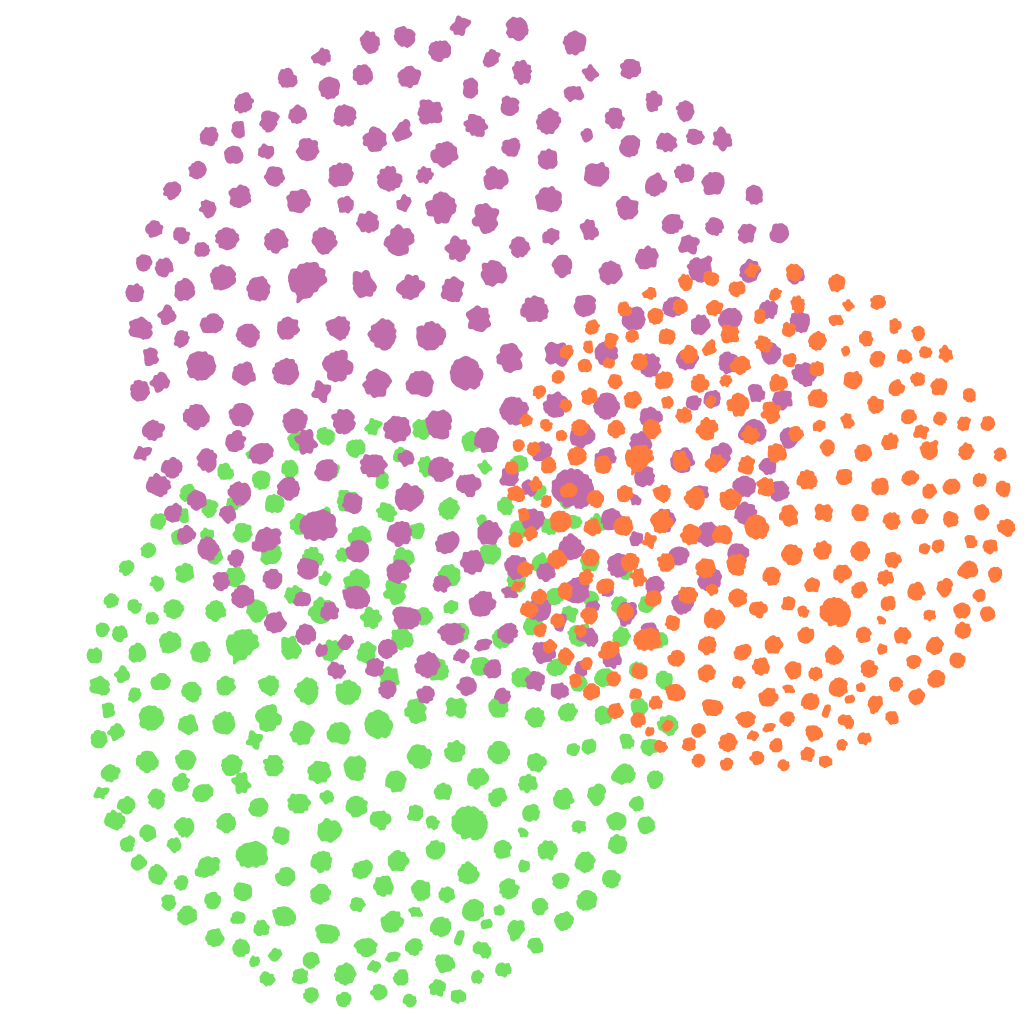
regeneration
culture
creativity
humour
nature
leadership
wonder
strategy
one another
How might we inspire purpose, deepen engagement and deliver impact?
Engage Change is dedicated to exploring questions like this with changemakers like you – in enterprises, communities and networks across Australia.
Strategy. Exploring better futures with purpose
To gain clarity, lead with passion and focus on what’s most important, we all need insight, guidance and professional support.
Our work in strategy considers your core values, the systems within which we operate, and how you can successfully inspire, inform and involve others with your mission.
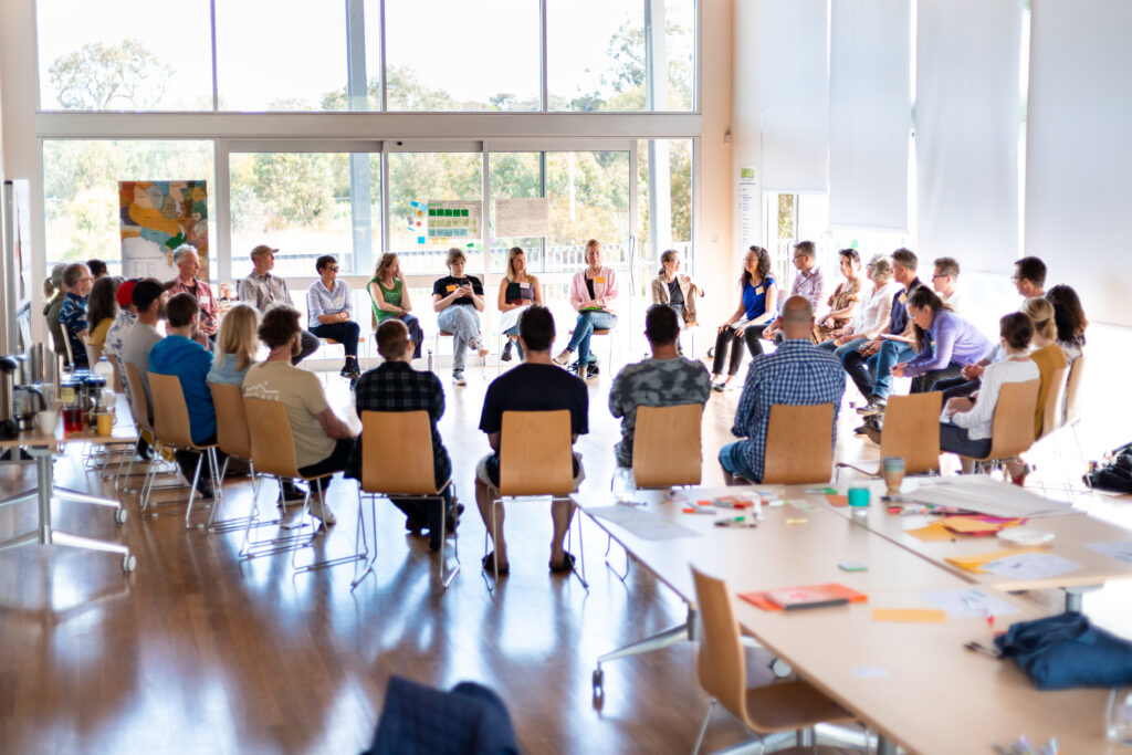
Facilitation. Co-creating and curating connection
Our approach to facilitating and designing workshops and larger-scale gatherings and strategic forums brings out the best from the co-design process.
We can help you creatively think and work through processes to reimagine social, environmental and economic relationships, stories and outcomes.
Mentoring. Building on leadership strengths
A trusted advisor is an asset at any stage of your career or enterprise. Matthew brings decades of experience across the realms of business, community and government to one-on-one sessions for values-driven individuals.
A new enterprise, exploration of new networks, or simply a sounding board for your strategy, investments or hiring decisions can benefit from mentoring – what we focus on starts with you.
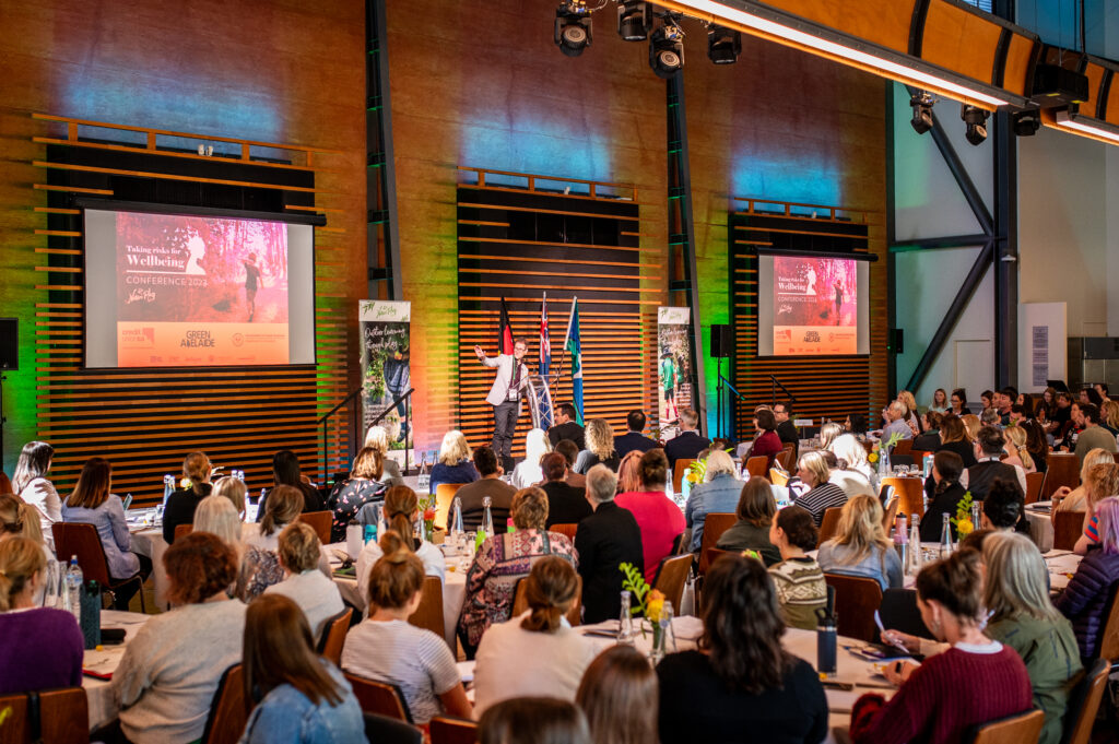
Emceeing. Bringing everyone’s stories together
It’s a great feeling when everything goes well with a big conference, forum or event. Curation and production are important, though it’s vital to have a great emcee.
Matthew, Engage Change’s founder, is a natural event host, bringing warmth, empathy, responsible time management and a sense of humour to your in-person, online or hybrid events.
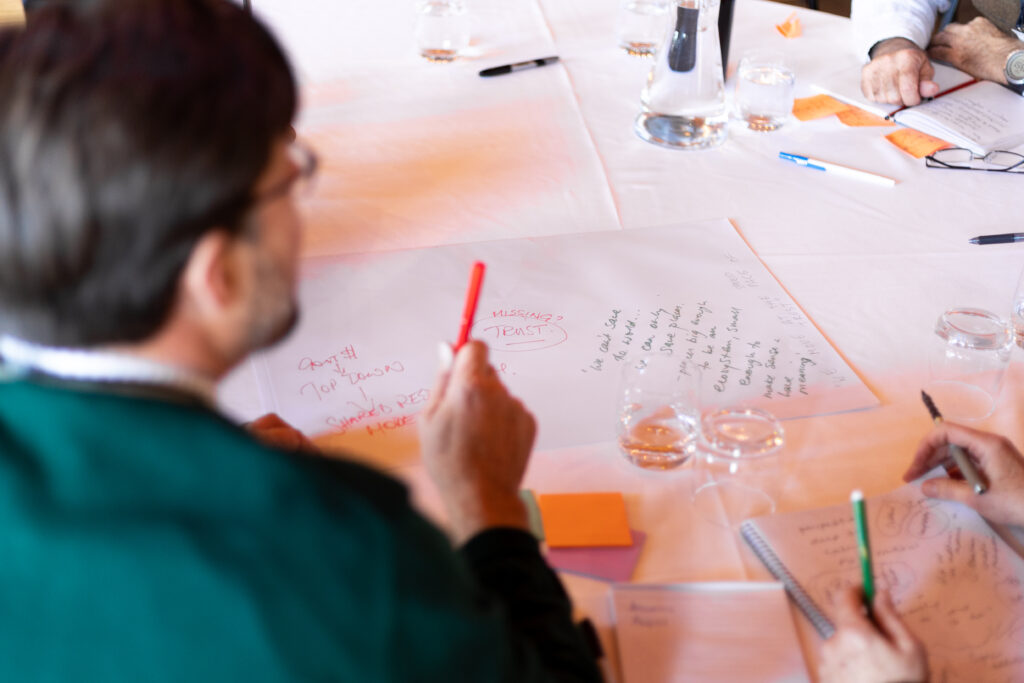
Storytelling. Articulating and sharing inspiration
We all need to be understood. This is why stories matter so much. The way we communicate; the language, imagery, media and how it’s shared needs to look, sound and feel authentic.
We can help your story, your brand and the movement you lead to be understood, embraced and shared by your community.
Activation. Delivering changemaking projects and experiences
With genuine partnership almost anything is possible in organisations, communities and places.
We design ways to bring people together with empathy and ingenuity, enabling new relationships, narratives and projects of any scale to take root and flourish.


Hearts, Minds and Guts
How might we bring our passion, intellect and grit to the work of changing our world?
Hearts, Minds and Guts is a fascinating and fun leadership development and team-building experience. This highly adaptable workshop is designed for purposeful humans in almost any business, community or government organisation or network.
Available in person, online and in hybrid mode. Enquire to learn more.
Some nice things people have to say about us…
Engage Change is a collaborative consultancy connecting people with impact.
If you are ready to deepen engagement and embrace change for your community, your cause or your customers, let’s talk.

Matthew Wright-Simon (he/him). Founder of
Engage Change
Matthew is the energetic human behind Engage Change. Along with a range of collaborators across Australia, Matthew supports businesses, institutions, governments, communities and networks to deeply explore problems, co-create strategy, articulate engaging stories and take pragmatic action.
Prior to launching Engage Change, Matthew led Ecocreative, a pioneering design and communications consultancy (founded in 1998).
Matthew holds qualifications from the Regenesis Institute of Regenerative Practice, the International Association for Public Participation, Common Cause Australia and the Leaders Institute of South Australia.
Matthew is also co-director of Newday Leadership, a unique social enterprise devoted to ‘inspired leadership for the greater good’. Newday holds an annual leadership summit in November and in 2023 delivered its first regional program for regenerative leaders.
As local Dean of microphilanthropy group, the Awesome Foundation, Matthew has helped give away more than $90,000 to people ‘doing something awesome’. To grow the influence of South Australian philanthropy, Matthew recently joined the state’s Impact 100 network.
In 2020, Matthew was honoured with an Impact 25 Award as a ‘changemaker champion’.
Connect. Curious about working with Engage Change?
Email hello@engagechange.au or call +61 8 7228 6850.
If you’d like an occasional newsletter packed with positive and inspiring content, it’s easy to subscribe.
Ngadlu tampinthi, Kaurna Miyurna yaitya yarta-mathanya Wama Tarntanyaku. Ngadlu tampinthi purkarna puki-unangku, yalaka, tarrkarritya. We acknowledge the Kaurna people are the traditional custodians of the Adelaide Plains and pay respects to Elders past, present and future.
© Engage Change 2024 | Privacy
× Close
Subscribe
Occasional newsletter packed with positive and inspiring content
Looking for Ecocreative?
Ecocreative took various forms since its inception in 1998, evolving from a design studio and communications consultancy into a strategic engagement service provider. In human years, that’s a generation.
Engage Change is not a new phase of Ecocreative, so much as a regeneration; something new and ready for these times of great challenge and opportunity.
If you need to connect with anything from our past, drop us a line. Better still, learn more about Engage Change.
Privacy policy and terms
Engage Change is committed to the protection of your personal information.
This Privacy Policy deals with the way Engage Change will collect, use, disclose, store and protect your personal information. This Policy also describes the way in which you may contact Engage Change if you have any concerns in relation to your privacy.
How does Engage Change collect your personal information?
Engage Change will only collect your personal information and sensitive information where you have consented, or otherwise in accordance with the law.
Engage Change will usually collect your personal information directly from you through your interactions with us via the Engage Change website (e.g. contact page or newsletter subscription).
When Engage Change collects your personal information, we will take reasonable steps to ensure that you are made aware of the details of the collection, including the purposes for which the information was collected, the organisations (if any) to which the information will be disclosed, and notify you of any changes to the Policy outlined below.
What types of personal information does Engage Change usually collect?
Engage Change may collect personal information such as:
- Your name.
- Your email address.
- Your phone number.
- Any personal information voluntarily provided as part of an enquiry or message via our contact page.
How does Engage Change use your personal information?
Engage Change uses your personal information for the main purposes of:
- Gathering user analytics for research purposes.
- Informing you of some Engage Change services, events or resources which may interest you.
- Answering enquiries from individuals, businesses, and industry partners.
Log Data
Like many website operators, Engage Change collects information that your browser sends whenever you visit our website (Log Data).
This Log Data may include information such as your computer’s Internet Protocol (IP) address, browser type, browser version, the pages of the Engage Change website that you visit, the time and date of your visit, the time spent on those pages and other statistics.
In addition, Engage Change may use third party services, such as the Google Analytics Web statistics service, that collect, monitor and analyse this type of information in order to increase our functionality. These third party service providers have their own privacy policies addressing how they use such information.
Data collection and cookies
Engage Change may collect your personal information through the Engage Change website, such as your email address or other contact details when you make an enquiry with Engage Change. Engage Change will deal with this personal information in accordance with this Policy and the law.
To improve your experience of this website, Engage Change may also collect data through use of ‘cookies’. Cookies are small data files that your Internet browser stores on your computer or other mobile device, to identify you as a visitor to that website and to remember your preferences. Cookies are stored in order for your browser to navigate a website—the cookies themselves cannot collect any information stored on your computer or other device which personally identifies you.
Engage Change will not use cookies to collect your identifying personal information. The cookies may collect statistical information about your visit to the Engage Change website (such as the pages you visit on the website) in order to remember your preferences and provide you with a more user-friendly experience.
The default setting of most Internet browsers is to accept cookies automatically, but you can actively delete or disable cookies by changing your browser settings. However, please note that doing this may adversely affect the full functionality of this website.
Contact Engage Change
If you would like further information about Engage Change’s Privacy Policy and procedures or have any complaints or concerns regarding your privacy, please contact us.
Changes to this Policy
We may revise this Policy from time to time. We will update you on any changes to this Policy through our website.